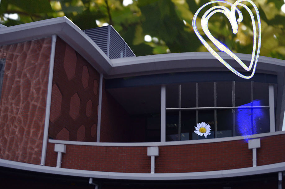
In this piece of work I used multiple photoshop skills to create the image. My aim was to create something simple but also to show a few of the different skills we've learnt throughout this project, I included a range of pictures I took of buildings and small details of architecture and my surrounding for example things like shapes in the architecture, plants, the buildings.
My first layer started off as just the building of E block in my school, I changed the colour balance to make the picture more pink to add a little bit more colour to it, I used the warp tool to make the building more curvy and more abstract. I used the quick selection tool to select the sky and i deleted it in order to make the background transparent so I can add another picture to replace the boring, dull sky into something more fascinating and unnatural. I then got a picture of a gate that I took from the basketball court and used the quick selection to take away what was behind it, I used the distort tool to bend the picture to fit the boarders of the building so it looks as though it's part of the building.
I took a picture of a broken window, I thought it was a good idea to put against a wall to give the wall a "broken glass" effect, I decreased the opacity so the wall is visible but the cracks still show, I also used the 'Lighten" effect on photoshop to loose the blue colour and make it more translucent so the wall behind is more visible and so the cracks don't fade as much. I then moved on to adding the hexagon shapes. Originally, it was the net of the ping pong table. I used the quick selection tool to select the holes and cut them out so that it's transparent. I lowered the opacity of the picture and cropped it to my desirable size, I went onto using the distort tool again so that it fits the size of the wall.
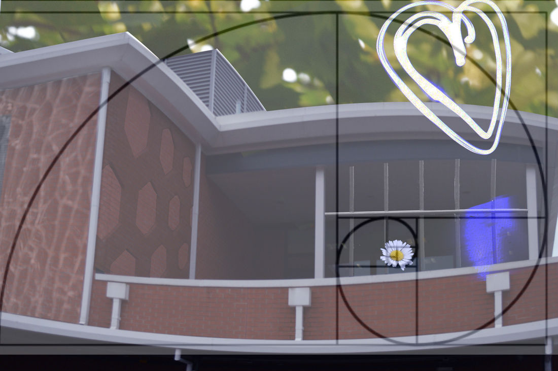
Lastly, I used a picture we took a while ago where we showed some light work skills, I set the camera for 3 seconds and i drew a heart to create the shape of a heart. to make the light only visible I used the "Lighten" effect to get rid of the dark background but I could still see patches of the background therefore I turned up the contrast until I couldn't see anything more, It also left a "light leak" effect on it, I thought it looked interesting so I left it in rather than erasing it. I also added in a daisy, I used the quick selection tool to delete the surrounding of the flower and i placed it on the building. I thought that added the flower would stand out as it's different from everything else in the picture. I turned down the blue and red in the colour adjustment section to give it a purple tint to it just so it fits in with the cool tones in the picture (excluding the background of bright, green leaves.) I noticed that the flower fitted the golden ratio well as the daisy lands until the end of the swirl of the golden ratio. I put a picture of the golden ratio and lowered the opacity to show reference.
One thing I could improve on in this piece of work is add something in the centre as it's quite empty, more things are going on at the sides and are cluttered whereas the middle of the picture is usually where the main focus should be. By doing this, it makes the picture look unprofessional. However, one thing I did do well was use a "Triangle Composition" where the light leak, heart and flower made a triangle as it groups a point and makes the viewer focus on them the most.
My first layer started off as just the building of E block in my school, I changed the colour balance to make the picture more pink to add a little bit more colour to it, I used the warp tool to make the building more curvy and more abstract. I used the quick selection tool to select the sky and i deleted it in order to make the background transparent so I can add another picture to replace the boring, dull sky into something more fascinating and unnatural. I then got a picture of a gate that I took from the basketball court and used the quick selection to take away what was behind it, I used the distort tool to bend the picture to fit the boarders of the building so it looks as though it's part of the building.
I took a picture of a broken window, I thought it was a good idea to put against a wall to give the wall a "broken glass" effect, I decreased the opacity so the wall is visible but the cracks still show, I also used the 'Lighten" effect on photoshop to loose the blue colour and make it more translucent so the wall behind is more visible and so the cracks don't fade as much. I then moved on to adding the hexagon shapes. Originally, it was the net of the ping pong table. I used the quick selection tool to select the holes and cut them out so that it's transparent. I lowered the opacity of the picture and cropped it to my desirable size, I went onto using the distort tool again so that it fits the size of the wall.
Lastly, I used a picture we took a while ago where we showed some light work skills, I set the camera for 3 seconds and i drew a heart to create the shape of a heart. to make the light only visible I used the "Lighten" effect to get rid of the dark background but I could still see patches of the background therefore I turned up the contrast until I couldn't see anything more, It also left a "light leak" effect on it, I thought it looked interesting so I left it in rather than erasing it. I also added in a daisy, I used the quick selection tool to delete the surrounding of the flower and i placed it on the building. I thought that added the flower would stand out as it's different from everything else in the picture. I turned down the blue and red in the colour adjustment section to give it a purple tint to it just so it fits in with the cool tones in the picture (excluding the background of bright, green leaves.) I noticed that the flower fitted the golden ratio well as the daisy lands until the end of the swirl of the golden ratio. I put a picture of the golden ratio and lowered the opacity to show reference.
One thing I could improve on in this piece of work is add something in the centre as it's quite empty, more things are going on at the sides and are cluttered whereas the middle of the picture is usually where the main focus should be. By doing this, it makes the picture look unprofessional. However, one thing I did do well was use a "Triangle Composition" where the light leak, heart and flower made a triangle as it groups a point and makes the viewer focus on them the most.
